
MENU
MENU
Let’s get this out in the open.
I judge cards.
Not the message. Not the handwriting. Not even the glitter (although we’ll come back to that).
I judge the paper.
If you’ve ever picked up a greeting card that flopped over like a tired pancake, you’ll understand why this article exists. Because paper weight matters. And whether you’re buying a card… or planning to start your own greeting card business… it matters more than you think.
Here’s a quick test.
Pick up a card. Hold it by one corner.
Does it:
If it feels suspiciously similar to recycled cereal packaging, we have a problem.
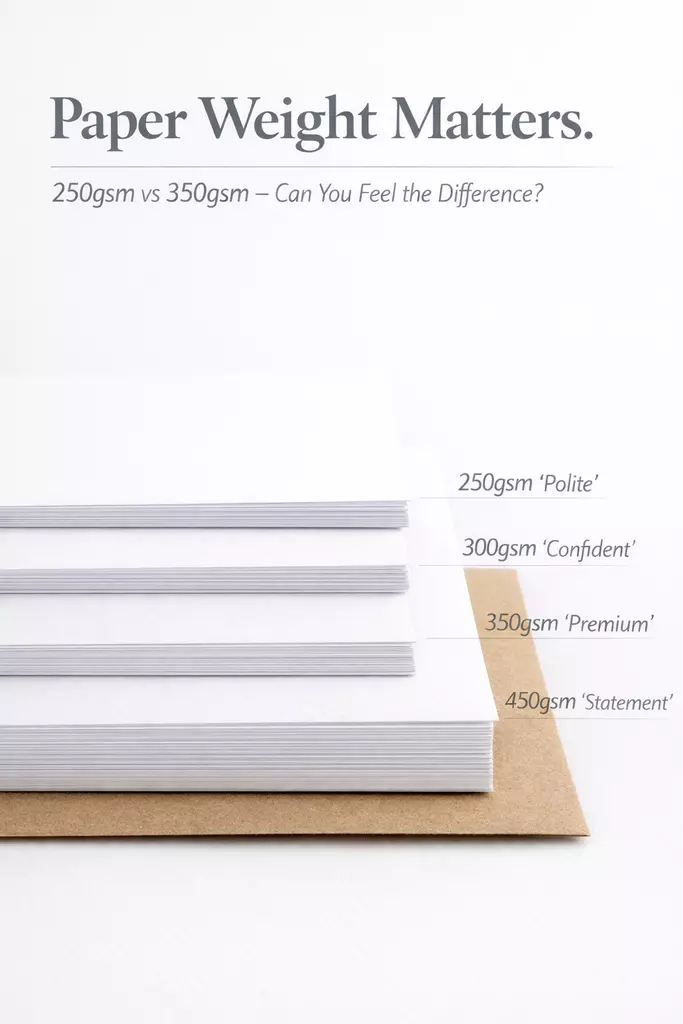
This is where GSM comes in.
GSM stands for grams per square metre. No, it’s not exciting. Yes, it is important.
In simple terms, GSM tells you how thick and sturdy your paper is.
Here’s the real-world breakdown:
If you’re buying cards for personal use, 300–350gsm is usually the sweet spot. It feels premium without being overkill.
If you’re starting a greeting card business? Your paper weight is part of your brand. Customers notice it — even if they don’t know they notice it.
There’s psychology at play.
Heavier card:
Flimsy card feels like:
“I picked this up in a rush while buying milk.”
And if you’re selling cards? That feeling affects whether someone buys from you again.
Now here’s where card snobbery becomes dangerous.
More GSM doesn’t automatically mean better.
If the card is too thick:
That’s why pre-scored card blanks exist. They give you a clean, professional fold without cracking or uneven creasing — especially on thicker stock. (Your future self will absolutely thank you.)
If you’re printing at home, always check your printer specs. Many standard home printers comfortably handle up to 250–300gsm. Some can manage 350gsm if they have a rear feed tray designed for thicker stock.
Never assume. Your printer has boundaries.
If you’re just buying cards to send, here’s what to look for:
Paper weight affects all of that.
A beautifully designed card printed on poor-quality stock will always feel slightly disappointing. You might not consciously know why… but you’ll feel it.
If you’re thinking about starting your own card business, here’s some straight talk:
Paper is not where you cut corners.
Your design might be stunning. Your branding might be clever. Your Instagram feed might be flawless. But if the card feels flimsy, customers won’t describe it as “minimalist” — they’ll describe it as “thin.”
A strong starting point for handmade or printed greeting cards is:
White card is popular for a reason — it’s versatile, professional, and lets your design do the talking. Whether you’re printing bold graphics or keeping things minimal, a solid white base gives you consistency and reliability.
Kraft envelopes in particular have that understated, confident look — they don’t scream for attention, but they quietly make everything feel more considered.
While we’re confessing… paper finish plays a role:
If you’re printing your own designs, choosing between gloss and silk can completely change how your colours appear. Gloss tends to give you punch and vibrancy, while silk offers a softer, more refined finish that still holds colour beautifully.
(If you want to compare properly, you can explore our gloss and silk paper range here.)
There’s no “best.” There’s only “best for your design.”
Just don’t put a muted, earthy illustration on ultra-gloss and then act surprised when it looks like it’s auditioning for a nightclub flyer.
Most people won’t say: “Oh, this is clearly 350gsm.”
But they will say: “This feels lovely.”
And that’s the point.
Paper weight is one of those invisible quality markers. It’s subtle. It’s quiet. But it does the heavy lifting (literally).
Being a card snob isn’t about being fussy.
It’s about appreciating the details that make something feel thoughtful instead of rushed.
Whether you’re sending one heartfelt message… or building a greeting card empire from your spare bedroom… choose your paper like it matters.
Because it does.
For most greeting cards, 300gsm to 350gsm is the sweet spot. It feels sturdy, stands upright properly, and gives that “this is a proper card” impression. 250gsm works well for lighter designs or when printing at home. 450gsm is ideal if you want a luxury feel or a very bold, premium look.
Yes — 250gsm is a solid, reliable choice. It’s thicker than standard printer paper and works well for many home printers. If you want a noticeably premium feel, moving up to 300gsm or 350gsm makes a difference you can feel immediately.
Many home printers can comfortably handle 250gsm to 300gsm. Some higher-spec printers (especially those with a rear manual feed tray) can manage 350gsm, but always check your printer’s specifications first.
If you’re unsure, test with a small quantity before committing to a large print run. Printers have feelings too — and limits.
GSM measures weight (grams per square metre), not actual millimetre thickness. In general, a higher GSM means thicker, sturdier card — but different finishes and materials can slightly affect how thick a sheet feels. So while GSM is your best guide, the finish and fibre composition also play a part.
Not always.
Heavier card feels more premium and stands upright better, but it can be harder to print on at home, crack when folded if not properly pre-scored, and increase postage costs for businesses. The “best” weight depends on your design, printer, and intended use.
For most small card businesses, 300gsm or 350gsm is a strong starting point. Pairing sturdy card with brown kraft envelopes creates a simple, professional finish that works for almost any style — from minimalist to rustic.
Yes — just in a different way. Paper weight affects how sturdy your card feels. Paper finish affects how your design looks.
Gloss makes colours pop. Silk gives a smooth, refined appearance. Matte offers a softer, elegant look and is easier to write on. The best results come from matching weight and finish to your design style.